We are Highlight Arts!
27th January 2015Welcome to our new website, we’re happy you visited. You might have noticed Reel Festivals has a new name and a shiny new logo to go with it.
![]()
As we were making the transition from Reel Festivals to Highlight Arts we had a lot to think about — our core values, our mission statement, our name, our new logo.
We decided at the end of 2013 that the ‘Reel Arts’ moniker didn’t fully articulate what it is we do or why we do it. As a collective of musicians, filmmakers, activists, poets and translators we all have a myriad of personal reasons why bringing artists together to celebrate community and foster empathy across borders is important to us. However, we managed to boil our goals down to this almost poetic mission statement:
We organise festivals, events and workshops to uncover stories about people and places affected by conflict. Using the arts as a tool to promote unity and solidarity with communities and individuals affected by a range of conflicts from inequality, prejudice, war and environmental issues we collaborate with artists and organisations from around the globe. The results of these collaborations are inspiring narratives that challenge stereotypes and encourage dialogue and debate. We endeavour to create new forms and channels of engagement in the UK and internationally whilst celebrating our interconnected world.
We then needed a name. Some of them were brilliant and some were hilarious. Some were neither. We considered: Bang the Box, The Elemental, Hump House, Continuum Arts, Arts Across, and Wide Open Projects! (yes, with an exclamation point).
We’re glad we settled on Highlight Arts.
Once we had a name that we could say with confidence (Hi, I’m Julie from Hump House, just sounded wrong) we needed a logo. And this, perhaps, was the best part of the process. We sent our new name and mission statement to our talented designer friends at goodgood who are based in Boston and Detroit. In their own words goodgood “seek to create unexpected, joyful experiences in the everyday.”
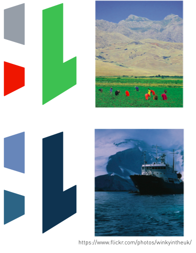
With our new logo, we think they did just that. They wanted to create an image which could represent the ability to share perspective and dimension, while conveying solidarity and strength. Inspired by the principles of gestalt theory, which shows that human visual perception can combine disparate forms into one unified whole, they combined the negative form (“H”) and the positive form (“L”) giving the viewer an opportunity to discover and create the form in their mind’s eye. The logo is a visual metaphor illustrating the ideas of: perspective, revelation and complexity.
We love how you need to look at the HL twice and in two different ways to catch the meaning of it. To us, it summarises exactly what Highlight Arts is about and encapsulates our belief that art changes impressions.
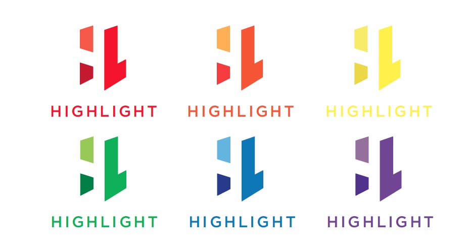
But wait — there’s more — our HL logo is also imbued with colour changing magic! When we place the logo on a multi coloured background, we can match the colours of that background in our logo’s three shading areas.
The logo was designed by Joshua Rolfe and art directed by Benjamin Gaydos from goodgood
Here is the blurb they wrote about the process:
http://goodgoodland.com/portfolio/highlight-arts/